05 / TypographyDownload fonts ↓
Words with
character.
Clear, confident typography.
Made to be read.
Aa
Headlines & short text
Sora
Our primary typeface for titles, introductory text, subheadings and captions.
RegularSemiboldExtrabold
Get Sora on Google Fonts (opens in a new tab)
Aa
Paragraphs & body copy
Lexend Deca
Our secondary typeface brings clarity to longer text, presentations and the web.
LightRegularMedium
Get Lexend Deca on Google Fonts (opens in a new tab)
For collaborative cloud presentations, use Sora for headings and Google Sans for body copy.
Correct & incorrect useKeep our signature
Keep our signature
consistent.
The logo’s typography, proportions, and spacing form a single signature. Preserve them in every application.

Use the original artwork.
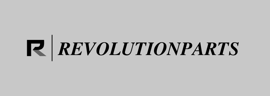
Don’t change official fonts.
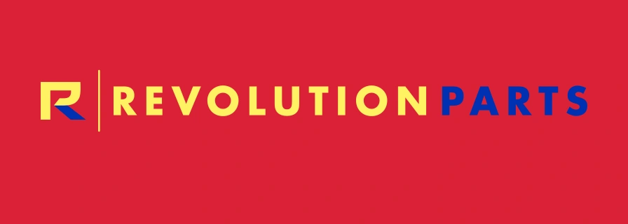
Don’t use colors outside the brand palette.
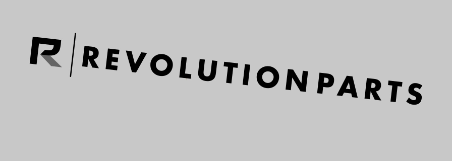
Don’t rotate the logo.
Don’t violate the clear space.
Don’t change the proportions between elements.
Don’t modify the visual harmony.